...
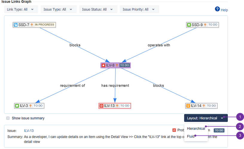
Connections between issues could sometimes get complicated. In order to visualize them in a desired way, there are two graph layouts to choose from - "hierarchical" (2) and "fluid" (3). This is done after clicking the drop-down menu (1):
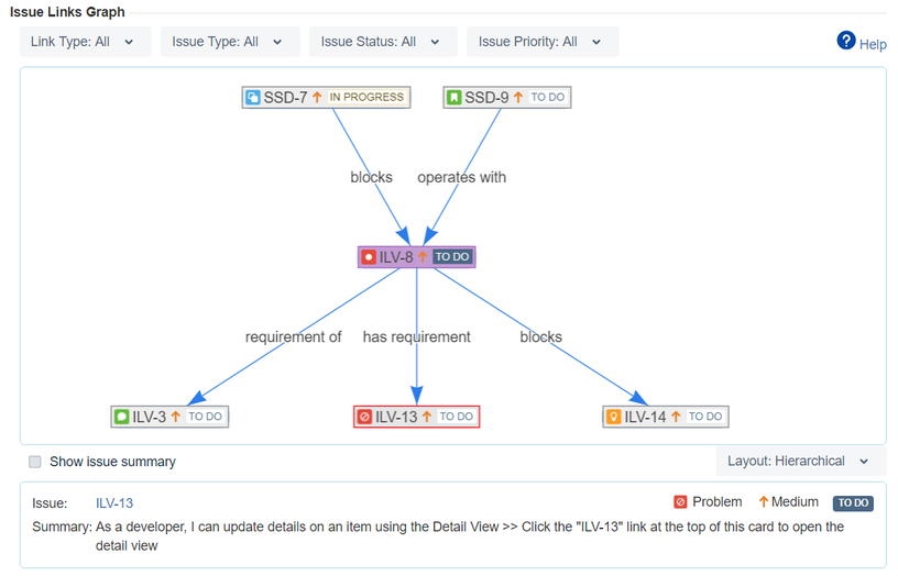
Hierarchical layout
This layout positions issues to clearly show the hierarchy between them. It is possible to move single issue only horizontally, so the levels of hierarchy are not disturbed. When an issue appears or disappears, the whole graph is gets rebuild to visualize new hierarchy for of visible issues.
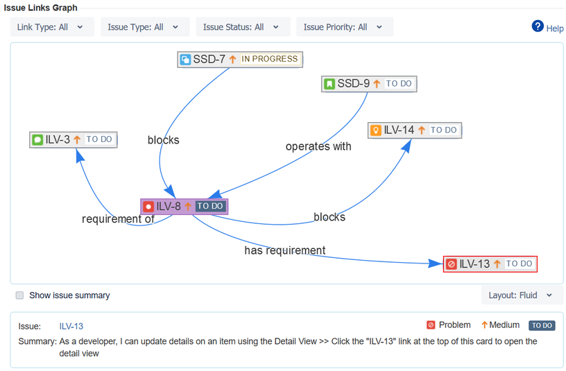
Disordered Fluid layout
This layout does not position place issues in any particular (predefined) way. It is possible to move issues freely. Shifting a single issue could affect positions of nearby issues, so the graph would not stay legible. To avoid such problem, when an issue appears or disappears, the graph adapts to that change, by showing a slow animation. Disordered Fluid layout is better for situations and environments, when issues are dynamically appearing and disappearing (e.g. fast-paced business environments). It is easier to keep track of these changes by incorporating into action offered its spectacular flexibility.


